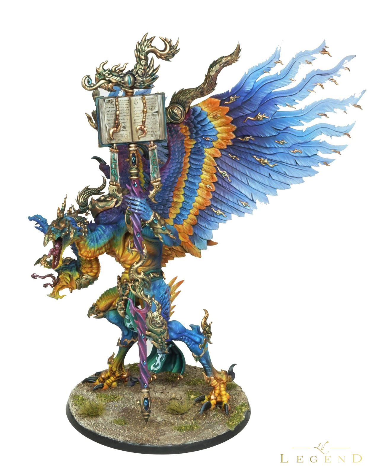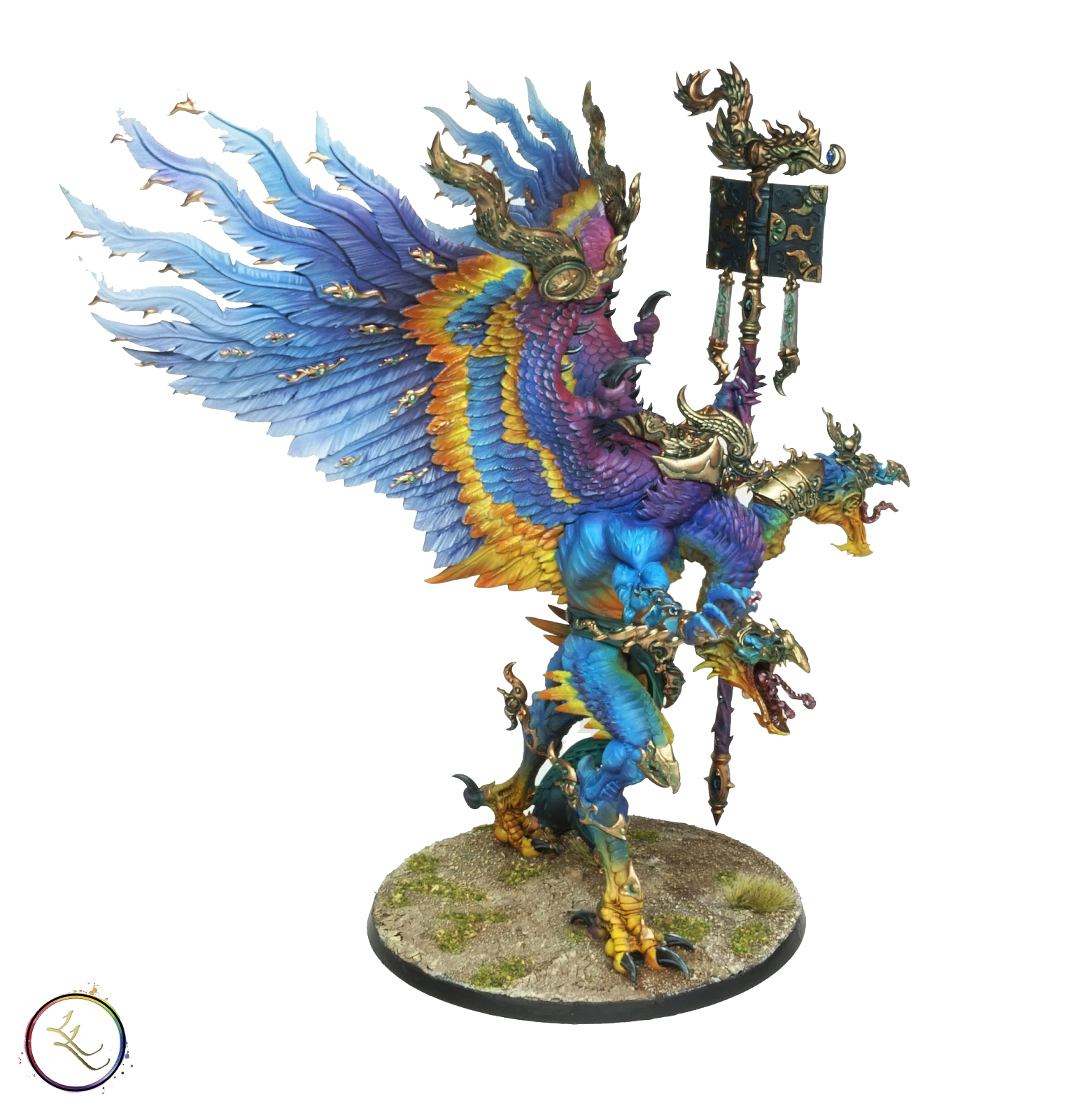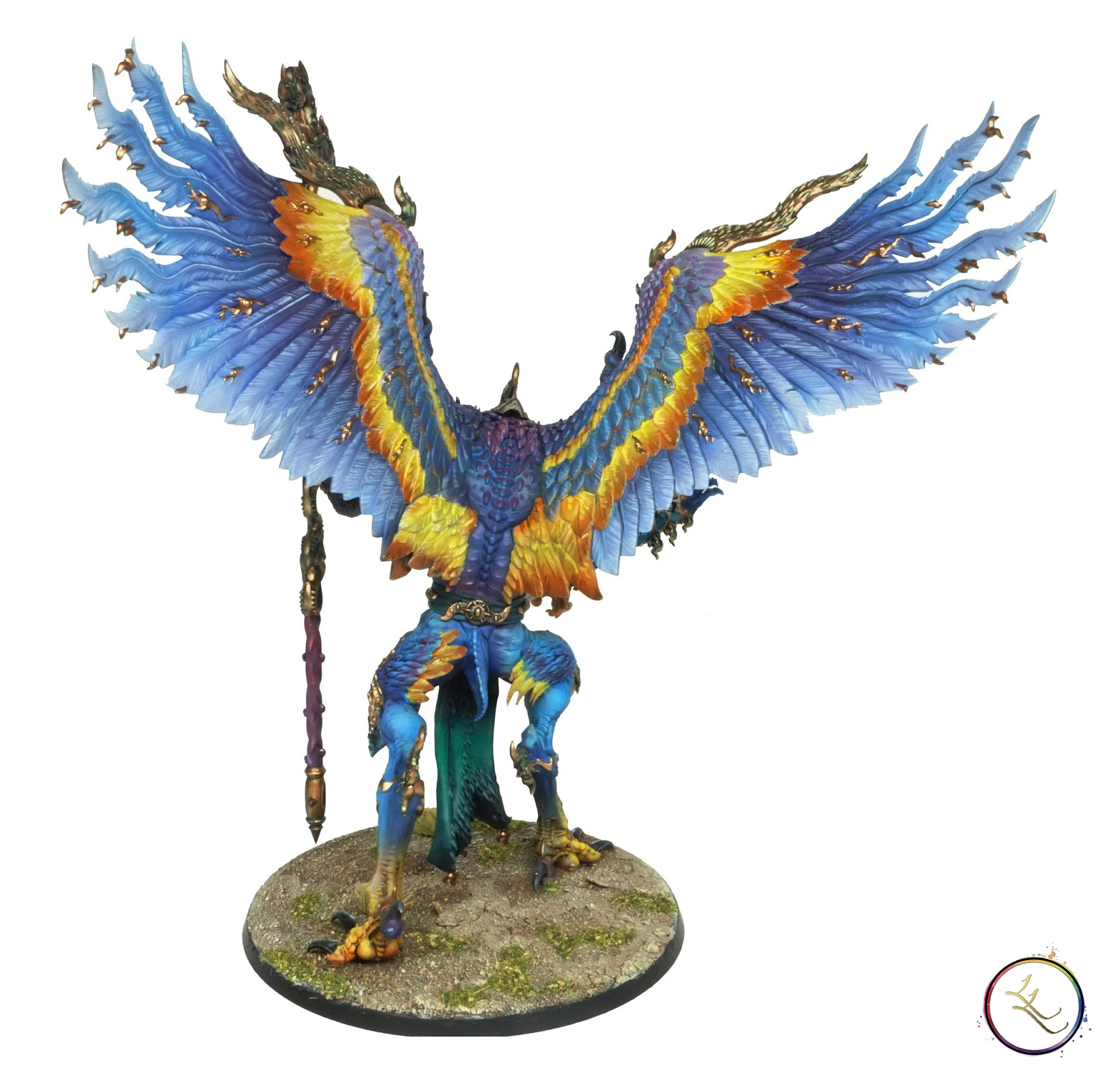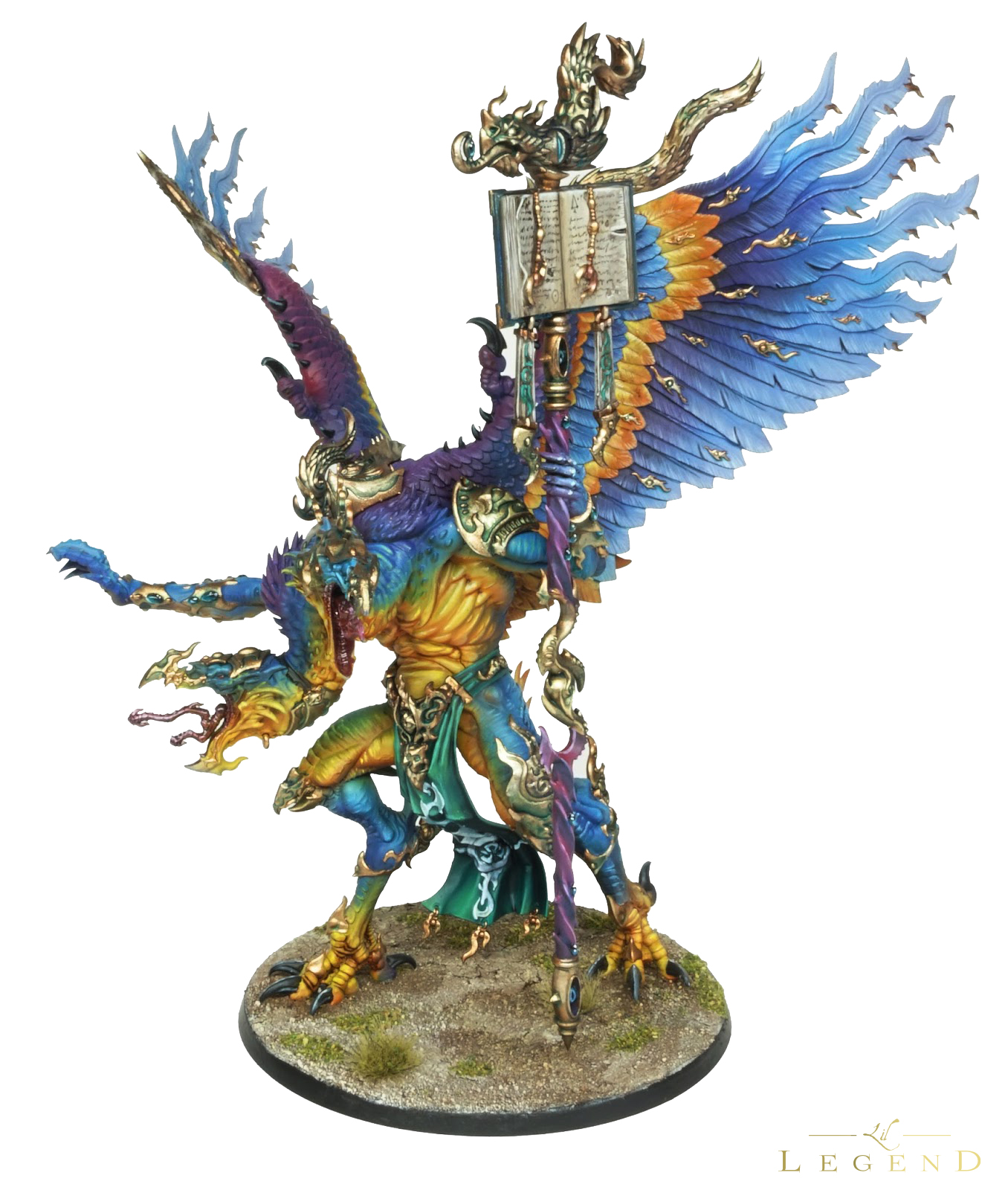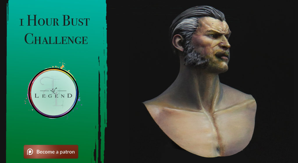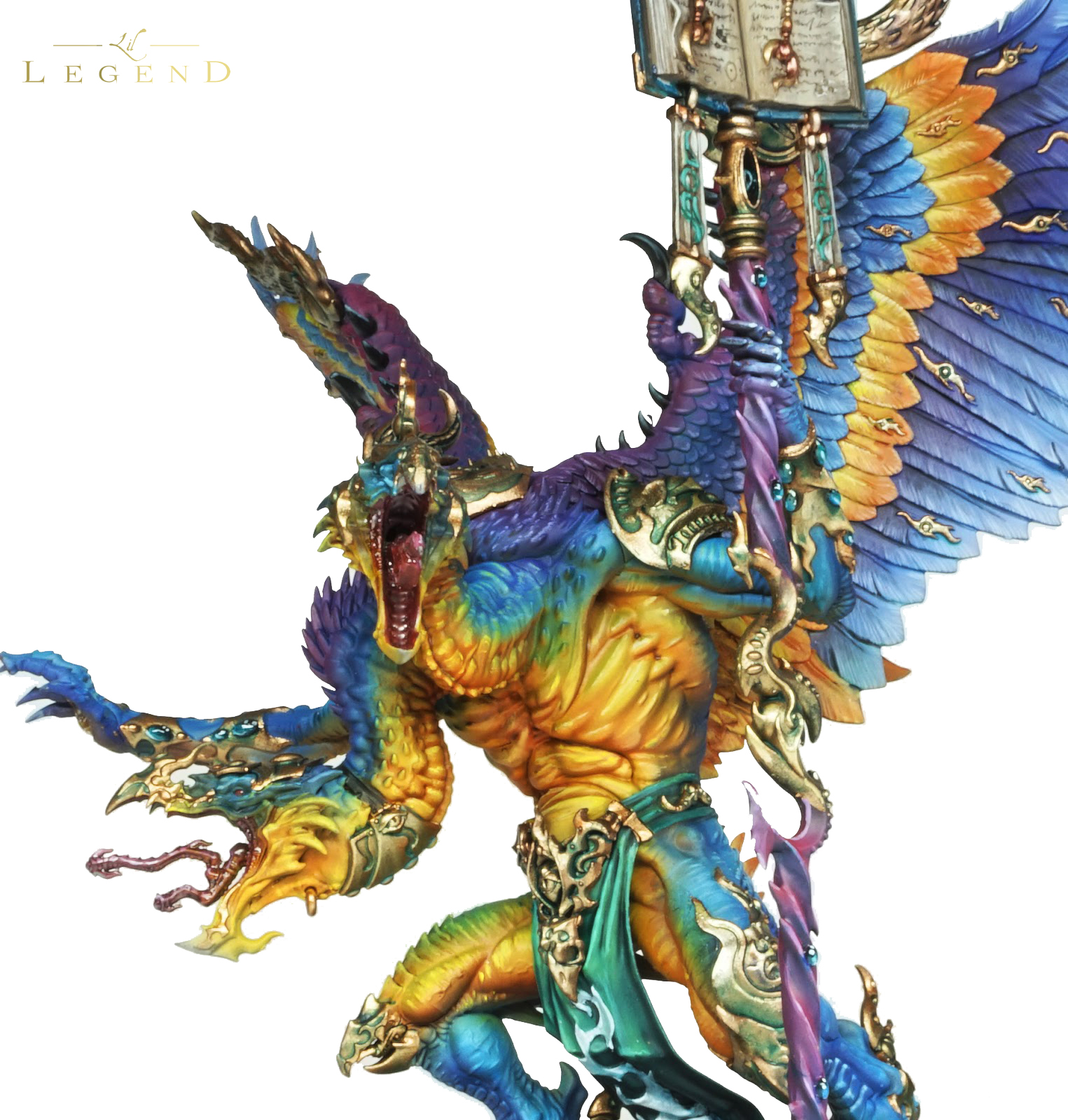
I decided to take a walk around the colour wheel with this model.
The client sent a wonderful picture of a kingfisher in mid-flight, with a plumage that ran the course from purple to yellow. It is easy to confuse the eye when using multiple colours on a piece, following the example found in nature gave a reassuring skeleton to the paint job that I could build on.
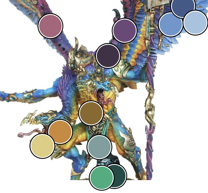
So how on earth do you use so many hues, but still retain some manner of control? Well, it all comes down to our knowledge of the colour wheel, and what values are.
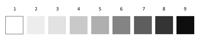
Value is the scale from black to white. Even if we use lots of colours we can still bring some to the fore and contrast others by using lighter or darker hues.

This is an example of a split complementary colour scheme. The dominant colours are turquoise, magenta and yellow. The loincloth is green, but it is a low value to help knock it back into the surroundings without having to compete with the other hues. Green has also been glazed into the shadows of the gold to help balance the top of the head with the bottom of the sculpt.